Orange and its combinations. Orange wallpaper in the interior: kitchen design and selection of suitable shades when decorating various living spaces Orange wallpaper in the interior of the house
Colors play an important role in interior design. The main color of the environment in the room can perform several practical functions at once. With it, you can visually change the parameters of a limited space, adjust the quality of visible light. Thus, it is able to directly influence the mood of the owner. To achieve the desired effect, you need to know the basic color combinations. Harmonious shades will create a comfortable environment for finding or living in this room. One of the brightest trends of recent times is the orange color in the interior. Adapting a positive, but somewhat aggressive color to the conditions of the room is quite a challenge. To deal with it, you should familiarize yourself with it. physical characteristics and psychology of human impact.
Palette characteristic
Orange is characterized by its assertiveness, defiant look. He demands attention and actively influences everyone without exception, even if he does it in different ways. Depending on the purpose of the room (be it a bedroom or a kitchen), its shades should vary. Since priority should be given not so much to creation as to providing the premises with an atmosphere of comfort.
In the color spectrum, orange is the warmest shade, and is located between red and yellow flowers. This largely determines its symbolic component, which can be described as life-affirming, sensual, dynamic. Mixing the meanings of the two surrounding colors here does not seem random, rather it accumulates their common energy.
Associations with strength, speed, youth, some pampering only complement the image of a charismatic color. They help to cope with negative trends in a person’s life, cleanse themselves of filth and just a dull mood. His presence can symbolize imminent changes, the opening of new horizons.
Color Features
These include the following points:
- Orange color excludes, only warmth is inherent in it;
- It has a beneficial effect on the human body, stimulating the improvement of the most significant organs (brain, stomach);
- Favorably affects the mood, creates a feeling of happiness. Giving joy is one of its main functions;
- The ability to activate the forces of a person and excite his energy went to orange from a red neighbor. At the same time, there is no negative aggression or a sense of anxiety inherent in the red color;
- Orange color is able to visually expand the space and increase the volume of objects;
- Its effect on surrounding objects can be characterized by a change in the purity of their immediate color. He makes them softer;
- Presence orange color in the interior is a motivating factor conducive to trusting human communication. His sensuality and emotionality can even go off scale.
Orange color has a whole universe of various shades, depending on the degree of approximation to the red or yellow neighbor in the spectrum. It is also able to absorb other colors (pink, gray), while forming completely new tones. For example, light shades include cream, pale peach or light apricot shades.
Bright, even fiery shades include tangerine, coral or amber, which are in perfect harmony with other colors, forming a rich range. The muted ones include those that contain discreet shades of beige, and are not provocative in nature (terracotta, ocher). Often they are used as the main color in the design of living rooms.
Role in the interior
The choice of this dynamic color is typical for optimists bursting with health and positive. Their conviction in their own ability to cope with life's difficulties is admirable. The demonstration of superiority, the warmth coming from them eloquently testifies to the absence of even a hint of a cloudy mood.
Stable associations with the sun, sea sand and oranges simply cannot act otherwise. The sages of the ancient East strongly associated it with church bells, which have a beneficial effect on the spiritual side of human life. Sailors and conquerors of mountain peaks have long used this color as a symbol of salvation, noticeable even at a great distance.
All these properties are also transferred to the creation of a comfortable interior in the house. Orange shades are used in a variety of styles suitable for rooms of any purpose. The universality of color does not make a difference between who exactly lives in a given room - a man or a woman, a boy or a girl. Therefore orange is the best choice for .
The unique ability of the orange color in the interior also lies in the fact that it brings the surrounding objects closer - be it a furniture set or walls. This necessitates a competent approach to design design, since abuse can lead to a visual reduction in space. In addition to approximation, it also visually increases their volume. Carpets in orange shades appear somewhat larger than their counterparts in a different color.
In interior design, the most commonly used shades are peach, pumpkin and terracotta, because they are subconsciously perceived better than bright aggressive tones.
Options for use in the interior of the house
- Combination with . essence this method is to create a concrete impression: in order for orange to appear only barely noticeable, it must be drowned in neutral, restrained colors. These are pastel mint and delicate cream tones that do not allow the active color to clear up. It is intended only to revive a boring interior, while drowning in a common light range.
For example, if the owner of the house has purchased a bright orange sofa that attracts too much attention, its catchy upholstery can be partially covered with a light cape. Such a technique will allow you to level out an overly poisonous shade, but at the same time leave its solar essence visible.
- Cooling of the color spectrum. To calm the riot of a bright fiery color, it is enough to recall the restraining influence of blue. The cool palette of shades of the latter is able to neutralize the tangerine madness of the former. It is recommended to use these two colors in equal proportions to balance the impression. You should also pay attention to the harmony of their combination. For example, discreet terracotta will look good with steel (cobalt as an option). Brighter, carrot or orange, should be combined with such cool shades as turquoise or azure.
- Show the courage of imagination. Here we mean the psychological moment. To decorate the room orange a lot of mind is not needed, but its correct application will make the interior more soulful. For example, saturated should not be used in a small space, it is much more suitable for a spacious room. Otherwise, a bright shade will cause anxiety in a person. An important point is also the selection of a suitable furniture set. It should create a certain contrast with an extraordinary shade of orange. For this, it is recommended to use light colors.
- Create an orange composition. It can be several items in the style of which an orange accent will stand out. It is bold to use a deep shade of rust or tangerine, as its texture will invariably divert all attention to itself. The remaining shades of orange will somewhat give in to his pressure, emphasize the dominant position.
At the same time, it is important not to allow the abuse of color. To do this, the space around the composition should be made as neutral as possible, white, sand or dark gray.
- Orange accent on unusual objects. To feel the completeness of the interior, there is often not enough “fire”, a catchy element. This can be any component of a furniture set - a dressing table or orange ends on all items. Much will depend on the owner himself. Only he knows which object should become central. There are no rules or exceptions here, everything is at the mercy of the person himself. Courage and determination must accompany the right choice.
- Ornament with orange small decorative elements. It is the most accurate and careful technique. Allows you to quickly organize bright accent in the interior, which can always be removed later. With orange shades, this is all the more true, since a person’s mood is not constant, it can often change. In addition, one should not discount the various fashion trends in designing. An example is the use of bright textiles, whether it's a throw in the bedroom or a patterned tablecloth in the kitchen. You can also brightly arrange kitchen utensils. There are actually a lot of options here.
Suitable premises
Most designers agree that the use of bright orange shades is appropriate in the kitchen (where it will encourage a friendly conversation), in the nursery (children simply need a symbol of the sun and happiness), in the office (it is very important to think positively), and also in the dining room ( because it stimulates the appetite).
And vice versa, you should not use bright color in the lounges, because then you will not be able to completely relax, something will distract. Also, a tangerine shade can negate all the romance of the bedroom.
The use of fiery orange in sunny areas is strictly contraindicated. And so the hot space will be red-hot. A similar effect must be avoided, neutralized with other shades.
As for the style, the most popular here are retro (this style includes the 60s), mexican style, country. Orange is also used in the more modern, minimalist designs of the east. But such classic styles as empire or try to avoid it, only occasionally combining it with brown.
In the interior of the living room
Its use in the living room is primarily due to the factor of friendliness, sociability of color. However, you should use pastel shades that do not strain your eyes. The actual use of orange can make the living room exit to the north side.
Then you just need to use orange inserts to warm it up in this way. It can be orange curtains combined with a bright sofa of the same shade. Or textile accessories on light objects.
Painting the entire space of the room with solid orange is not at all worth it. For a general harmony in the perception of orange inserts, it is recommended to use a combination with colors such as blue, gray, and also snow-white.
Some designers, on the contrary, recommend that in the living room you show courage and give free rein to your imagination. For example, paint the ceiling orange. This guarantees warmth and excellent mood to all guests. It should only be remembered that peach shades or the same ocher should be preferred to pure orange.
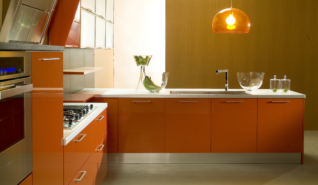
In the interior of the kitchen
Since scientists have long confirmed the beneficial effects of color on the digestive tract, its use in the kitchen is almost the best move.
Warm peach tones will significantly increase your appetite. It can be not only wallpaper or tiles on the walls, but also napkins, kitchen accessories, dishes in a characteristic orange color. If we are talking about furniture, then it is good to combine it with the gloss of facades.
The main condition for this will be the cleanliness of the selected surface, since a dirty orange tile will negate the entire comfortable effect.
In the interior of the bathroom
To relax in a warm room, it is enough to use colorful pieces of furniture, a variety of lockers.
 Matching black and gray colors and orange
 Their reflection in the mirror will contribute to the fact that the person's face will appear somewhat fresher and younger. Skin color will acquire a beautiful natural shade.

Orange wallpaper in the kitchen space or an orange kitchen always looks lively, original, dynamic and fresh. Modern designers offer many options for combinations of materials and colors in such a room.
Features of orange wallpaper
Among the advantages are:
- calming and relaxing effect on the nervous system;
- improving well-being;
- positive effect on concentration;
- contribute to the development of human creative abilities;
- fit well with different styles;
- soft shades give the room additional illumination;
- add bright accents;
- help improve appetite;
- give the interior cheerfulness and brightness;
- have a positive effect on mood.
The peculiarity of orange wallpaper is to visually displace other colors in the interior. See how they look in the kitchen.

Color combinations
Common combinations of orange with:

Selection rules
Most often, orange canvases are found in the decoration of the dining area of \u200b\u200bthe kitchen or in the cooking area. Most organically, such wallpapers look in modern design(minimalism), but are used in different styles.
Orange-colored photo wallpapers are usually used to decorate an accent wall. Fruit-themed wallpapers should have a natural pattern. What canvases are suitable for an orange kitchen, look at the photo.

Orange wallpaper with a pattern can be used to decorate furniture surfaces, focusing on the functional part of the room. Small patterns and ornaments based on floral motifs look best. Geometry and abstraction are also used in the interior of the kitchen. Large drawings will burden the room, it is not recommended to paste over the entire room with them.
In rooms with a northern orientation, such wallpapers will add additional light; in rooms on the south side, it is not recommended to use too bright shades. V classical style relief coatings on one of the walls look spectacular. See what a well-designed orange kitchen looks like.

combination
Among the options for combining in the kitchen, the following are most often used:

Furniture selection
In rooms with orange wallpaper, functional furniture in soft colors or a monochrome palette should be selected. Muted tones look good. Under the canvases of juicy warm shades, both light and dark furniture. To create classic interiors, it is better to use headsets in dark colors, this will create the effect of majesty and luxury. A light palette will serve as an excellent background for bright orange colors. The combination of yellow and white wallpaper and orange furniture in the photo:
You can emphasize the color of the wallpaper with a colorful table. Glass surfaces are good, for example, tables with a transparent top. The abundance of bright colors can be diluted with steel household appliances.
Pay attention to how the furniture in the orange kitchen looks correctly matched to the wallpaper in the photo.

What textile is suitable
You can complement the color of the wallpaper with the help of textile elements: cabinet furniture, curtains, potholders, tablecloths, towels. In rooms with muted apricot, peach tones, bright yellow or orange furniture looks good.
Curtains for the kitchen should be 1-2 tones lighter than wallpaper. Take a look at how successfully combined wallpaper with textiles in the photo.

If you want to focus on window openings, choose curtains in juicy orange, tangerine shades. If you do not want to highlight the window area, then choose curtains in white or pastel colors.
Kitchen decoration
In an orange kitchen there should be a minimum of decorating elements. Compact and simply decorated rooms look best.
Lighting
Bright fixtures will create good light accents on the walls. Good spot lighting, which is located around the perimeter of the ceiling. To create additional lighting in the dining area, dome-shaped wall lamps are used. If you want to illuminate kitchen facades, you need LED lighting. Look at the photo for a well-lit kitchen with orange wallpaper.

Ceiling finish
To decorate the ceiling, wood-like materials are used, which give the interior maximum naturalness: laminate, porcelain stoneware, clinker floor tiles. Glossy stretch ceiling visually expand the kitchen space.
Orange wallpaper in the kitchen or an orange set look lively, original and cheerful, bring brightness to the design. Keeping a few simple rules and following our advice, you will be able to create a lively, dynamic and interesting design. Create and fantasize! I wish you all success!
Orange kitchen options can be found in the following video:
We spend a lot of time in the kitchen. Here our morning begins with an invigorating mug of coffee, the day ends with a delicious dinner with relatives. Holidays and fun gatherings with friends do not bypass the kitchen. We also carry out the most daring culinary experiences here. The kitchen is the soul of the apartment, so it should be cozy, positive, stylish.

The psychology of color
Color plays an important role in interior design. To choose it correctly, you need to understand what you want to get as a result. Orange color improves mood, helps to cope with depression, energizes, helps to feel the taste of life. But there is one caveat: the orange color makes food more appetizing. Therefore, for those who are losing weight, it is better to avoid bright colors in the kitchen, and choose a calmer shade - peach.

Only one orange color in the kitchen should not be used. The interior will be heavy and tasteless. You can dilute it with wallpaper or curtains in other colors. Diversity and color will help bring and kitchen furniture.

When developing a design, it is worth considering the fact that the orange color draws all attention to itself. This shade is reminiscent of warm summer, relaxation and carelessness, so it is perfect for a kitchen in the northern part of the house. Orange will help keep you warm. Another orange palette can adjust the space and shape of the kitchen. The elongated room will become wider.

Good lighting will add additional brightness and joy to the orange kitchen. You should not be limited to one orange color, because it has a very wide palette. You can opt for orange, apricot, terracotta, carrot, coral. Each of these shades is able to bring juiciness, originality and brightness.

photos
Organic color combinations
Wallpaper for the kitchen should be selected, focusing on the color of the furniture. Orange headset dictates its own rules. You have to choose for it soothing colors. White, blue, pistachio, beige, gray, sandy, milky are suitable here.

For white it is better to choose a warm shade of orange. Dairy wallpaper will soften the interior of the orange kitchen. Lovers of modernity should take a closer look at gray, it will make the kitchen modern and fashionable. In this color version, the kitchen will become even more comfortable. Black should be used carefully, in small quantities, in detail.

green wallpaper it is better to choose calm shades - olive, mint, pistachio. With green, the entire orange palette is very organically combined. The design of such a kitchen will be complemented by floral patterns or an unusual print.

With lettuce shades the interior will be very fresh and energizing.

Suitable for lovers of tranquility beige wallpaper. They will calm the flashy orange color. The kitchen will turn out bright, but not defiant.

For bold and original
Blue - rather strict color because of its cold spectrum. Such wallpapers will make the orange kitchen more serious and presentable. For a simpler and more relaxed interior, blue wallpapers are suitable.

Luxury connoisseurs should choose wallpaper colors for the orange kitchen Ivory. Get a chic, expensive interior. Furniture must match the chosen style and be of high quality.

Eternal summer in the kitchen will allow you to achieve a combination of orange with sandy. Such a warm environment will help to relax and unwind. You can imagine yourself in a small cozy cafe on the seashore.

Do not match
With purple wallpaper, the combination of an orange headset will suit bold and original. This is quite a bold decision for the kitchen. This color scheme will add individuality to the interior. To slightly dilute such active colors, you can add light details. It is important to choose the right shades of orange and purple, otherwise it will turn out not stylish, but tasteless.

To the shiny surface of the headset will not fit matte wallpaper and vice versa. Materials must be of the same texture. Strict red matte wallpapers and shiny orange furniture will look very strange.

For a juicy orange, orange headset, it is better to glue the walls in light gray, yellow or milky. In such a situation, wallpapers of both light and dark shades are suitable. The main thing is that they are not flashy and do not clog the bright color of the kitchen set. Orange can be used to decorate walls, but only in small quantities, as elements and additional details.

Color photo wallpaper - another one not the best way for orange cuisine. Bright fruits on the photo wallpaper will take all the attention and will only make the interior heavy. In combination with energetic orange, a sad picture will turn out, despite the riot of colors.

Orange in interior styles
Under the brown furniture in the kitchen, orange wall cabinets are perfect. You can use white wallpaper with a large geometric print. Get a style with a reference to futurism. Above the worktop, you can stick structured brown-terracotta wallpaper or tiles in a small square.

For a glossy countertop or mirror table, orange style is a great choice. The kitchen will be light, airy, warm and cozy. This combination is suitable for minimalism or hi-tech.

Kitchen in Japanese style looks very concise and unusual. TO kitchen set orange color is suitable for dark brown plain wallpaper. The interior can be diversified with white inserts above the countertop. Furniture can also combine orange, brown and white. A picture with bamboo or sakura will harmoniously complement the interior.

Transparent bar stools, greenery and flowers in rectangular glass containers. Perfectly white ceiling, walls can be made a tone darker. Elongated lamps in metal design. Orange set and a massive white countertop. So you can create the perfect kitchen in a modern style.

Quality and material
When choosing the color of the wallpaper for the orange kitchen, do not forget about their quality. Since the wallpaper is designed for the kitchen, paper ones will definitely not work. It is also worth immediately abandoning fabric, acrylic and liquid. All these models are afraid of dirt and water. You won't be able to clean them.

Vinyl and non-woven wallpaper will be an ideal option for the kitchen. If necessary, they can be washed, it is wear-resistant and resistant to damage. For the kitchen, these are very important qualities. Over time, they will not fade or fade. Vinyl and interlining do not absorb odors, so there will be no unpleasant odors in the kitchen.
In recent years, many interior design professionals are increasingly seeking to use bright colors in the design. various rooms and premises of the apartment, using attractive materials for this. One of these materials is orange wallpaper. They, as well as their various combinations with canvases of other colors, are great for various interior styles. Moreover, they can be used not only on the walls, but sometimes on the ceiling. In today's article, we will look at the use of orange wallpaper in interior design using the example of kitchens and bedrooms, as well as other places in the living space. In addition, we will talk about how best to combine them with curtains and furniture.
The decision to use this color is quite bold. But if you do everything right, the result will not disappoint
Orange wallpaper for the kitchen
Sometimes choosing the main color in the kitchen is quite difficult. Designers recommend in this matter to build on the main purpose of the room, and in this case, the shade of the walls should help create a pleasant atmosphere and promote food intake. At the same time, of course, it is not necessary to work only with traditional "kitchen" colors. On the other hand, too bright and creative solutions best left for active areas (living room, hallway, etc.).
What should be the kitchen under the orange wallpaper
V color scheme this room should be as cozy and comfortable as possible. Well, besides this, you need to remember that a properly selected combination of colors can visually shift the intended boundaries, increasing or decreasing them, and make the room warmer.


So, when choosing the main color, you need to consider a number of factors:
- the theme of the interior and its style direction;
- side of the world;
- general geometry;
- personal preferences;
- the psychological impact of color.
Interior features with this color
This color is credited with the ability to visually reduce the total volume of the room, and at the same time, increase individual objects. It also actively affects those objects and surfaces that are in close proximity to it. Do not use it to finish the entire room. It is best to use orange in combination with other shades.
In addition, it is worth abandoning the monochrome filling of the interior, performing walls and furniture in it at the same time: it is best to prefer it for one thing. Well, to find correct group colors, you can use the color wheel.

We must remember! Since orange perfectly attracts attention, it should be used only to create accents, and best of all it emphasizes the following styles: avant-garde, ethnic, country, as well as minimalism. It is worth completely abandoning the use of this bright shade in the Baroque, Empire or classical interiors.
Orange Blossom Design Options
The question of compatibility has always been in the first place. Let's say you have an orange kitchen. What kind of wallpaper is better to stick in this case? We are considering another issue: you already have an orange-colored wallpaper. What furniture and curtains should be chosen in similar situation? As a rule, this background is chosen by passionate dreamers, but psychologists agree that orange helps to get rid of mental fatigue. Its overall palette is very extensive, ranging from delicate apricot shades to terracotta and carrot tones.


Some designers believe that it is best to choose orange wallpapers for the kitchen, stopping either at plain canvases or picking up those that have a certain pattern or are made in stripes. But you need to experiment with the saturation of tone very carefully, since there is always a risk of choosing an overly irritable shade, which, alas, will not be suitable for the kitchen.
By the way! To decorate the ceiling, you should prefer the classic white okrasu, but if desired, it can be decorated with small orange lamps. well and flooring should be more saturated, dark, making the room more comfortable. kitchen furniture It is best to choose in the color of natural wood.
For a successful color combination with orange wallpaper, you can choose apricot curtains with green contrasting elements. Also, white curtains will be very appropriate. These colors perfectly complement each other, forcing the interior of the room to open up in a new way. For orange wallpapers, you can find other equally interesting color combinations, such as olive, blue, brown and khaki.

Other premises
Although designers allow the use of orange wallpaper for the kitchen, they often use this color in the design of other living areas:
- Bedroom - here it is not used so often, as some of its shades are quite bright and aggressive. in Provence or country styles, and it is best combined with green or rich brown, as well as light curtains.
- Living room - this background is relevant especially for those rooms that face the north side. This color scheme is especially successful for those who regularly spend holidays in the living room, invite relatives and friends. Well, in order to eliminate the effect of irritation, it is worth decorating the living room in soft shades, and it is suitable for ethnic, African or oriental style. in this case it will be green.
- hallway is the best solution for a room where there is no natural daylight. Well, to make the hallway more hospitable, it should be decorated in soothing colors.
- Children's - it is recommended to introduce orange only for those children who suffer from apathy and are not active enough in life. In other cases, this tone should be used with extreme caution. Orange bright shades can only be included in the playing areas.
- Bathroom - if this room is small, then its use should be minimal, otherwise the bath will seem even smaller. It is best to use orange accents for bathrooms, which will bring warmth to the room.


Orange wallpaper for the bedroom
The most important room that has a fairly strong impact on the mood of the owner is the bedroom. It is very important to choose the right color for the bedroom - the main thing is to focus on your taste. Listen to your intuition, and you will understand which tone is closest to you. If you can't stop at a particular shade, choose orange. This cheerful, sunny, warm shade will delight you every day. In the morning, the orange interior will give you a charge of positive and energy for the whole day, and in the evening it will help you relax and unwind after a hard day.

Photo: classic interior and "juicy" orange colors
This natural, “orange” background symbolizes strength and energy, evokes joyful emotions, promotes brain activity and interesting communication. This color is intended for intuitive people, for dreamers. We meet him everywhere - fresh oranges, playful freckles, natural flowers, inviting sunset. It is this shade that will help relieve mental fatigue after a worker, psychologists say.
Choice


You can safely take apricot, peach, carrot, soft and even vital "sunny" shades. The walls of the room can be confidently glued to selected wallpapers, as a single-color type,. For calm, quiet people, it is better to choose calm pastel apricot or peach tones with a discreet print, but for active and energetic people - plain or with a small pattern.
You must take into account! You should not choose "flashy" too colorful and bright colors for this room - they will have a very negative effect on your vision.

In combination with orange wallpaper in the bedroom, the ceiling is best left classically white. It is better to choose a lamp or a lamp in similar bright colors for it. For an orange bedroom, a brown floor or parquet is suitable, which will create coziness and comfort in the room. You can perfectly complement the design of the interior space with the help of such decor elements as a white rug, light curtains, pillows of different shades of this bright background.
Combinations in the interior with other colors


The orange background goes well with green, blue, olive and of course with brown tone. Fill the design of the room with unusual combinations. The combination with green gives us a summery positive combination that will look good in an adult room.
Pleasing to the eye will also be a combination with blue hues. To soften a bright shade, you can use a combination with cream, beige or nude. This color combination will suit any furniture and various accessories. Sometimes a combination with black is allowed, provided that its presence is sufficiently limited, or present in furniture, decor elements or curtain ornament details.

Photo: an example of how well you can choose furniture and light-colored curtains
Create a sunny, warm cozy corner and spend wonderful time in it with your loved ones. Stop your choice on the orange bedroom - an island of warmth in your life.
Orange is the warmest color in the palette, and it's not even that there is no warmer, it just always stays that way regardless of the presentation and combination with other colors. It is possible, of course, to make it a little less or hotter by playing with its shades, but if other colors, depending on the design, can be both warm and cold, then orange (like blue, by the way) never change their temperature position. Therefore, such an interior is perfect for cold climates; in any damp or cool weather, an orange interior will be warm and sunny. But it is worth considering that if the window of the room faces the sunny side, and even more so if the climate is hot, then here you need to be careful with the orange color, otherwise there is a risk of making the interior too hot. Although lovers of the tropics will not be afraid.

Of course, this sunny color will fill any interior with a charge of energy and good mood, which is perfect for the kitchen, it will be a great start to the day.
Of course, orange motifs are also good for other rooms, especially if you skillfully combine them with other colors and shades.
Combined with white
The sunniest mood will be in an orange-white interior. It is the color that emphasizes the expressiveness and brightness of orange. A juicy and festive atmosphere, charged with inexhaustible energy, will always reign here. Ideal for .
It is also good to use these two colors in the bathroom: the cleanliness and sterility of white will, as it were, recharge with the energy of orange and invigorate in the morning.

For a children's room, the use of this union will have a beneficial effect on the development of the child. In the room, the baby will be comfortable, fun, but not too much, since the white will still slightly neutralize the intensity of the orange, which is very good for children, otherwise it will lead to hyperactivity and inability to concentrate.
With regard to the bedroom, we can say that the orange color will envelop a pleasant and soft coziness and a feeling of comfort, invigorate in the morning, but so that you can easily fall asleep at night, it is better to add White color.


In general, everything is based on temperature balance. The orange interior itself is very warm, but adding white can make it more moderate. And, accordingly, the more orange, the warmer the atmosphere and, conversely, the more white, the calmer it is. The latter, by the way, is more suitable for living rooms, since for the reception of people with different temperature preferences, it is better to choose a neutral environment and add some warmth to it in the form of orange accents.
In union with the tree
From time immemorial, it has been a symbol of comfort and harmony, but, in addition, it also has the ability to balance the activity of the orange range of colors. And it turns out a very harmonious environment, filled with natural naturalness.

The tree can be in a close tonality with orange, or much darker than it, or both, the main thing is that it will always be comfortable here. That is, it is such a harmonious union that any shades of wood fit perfectly. In addition, there is no need to add other colors, they will only ruin a great look, except for a little white as an accent.
duet with green
At the sight of green-orange interiors, the image of an orange tree is immediately drawn in my head. It is this natural association that this duet is often used to decorate rooms that seem to be filled with this sour-sweet taste, covered with lush greenery. By the way, for some, this combination may resemble a tangerine, which will be sweeter - this is a matter of taste. But what is good about this combination of colors is that it is more comfortable and unobtrusive, unlike, for example, the union with red.


But by varying the shades, you can make the interior not so juicy and bright, which would be too tiring, for example, for a children's room. For children, this is also a good combination, since everything connected with nature has a positive effect on them, but it is preferable to choose calmer shades, especially for hyperactive children.
In the kitchen, green-orange motifs will have a good appetite. Feng Shui experts believe that if there is a lot of greenery in the kitchen, then you will want to eat more salads, and this is useful. You can guess from yourself that the presence of orange encourages the use of oranges and tangerines, this is also very useful, the main thing is not to be allergic.
Orange and brown (chocolate)
This is a very harmonious and balanced combination. It is suitable for people who want to make their interior warm, cozy, but also energetic. In such an interior there will be no disharmony, and no matter what shades of orange are taken, they all blend perfectly with chocolate.


To rich orange, chocolate color is often taken, which reaches glossy black. It looks a little strict, but solid. In this embodiment, it is worth adding light surfaces, you can have a grayish tint. And the use of black, not only in this case, but, in general, with a brown-orange gamut is not desirable, this will lead to a compatibility conflict.

Despite the positivity of the orange color, few dare to make it dominant in the interior - after all, it is very warm, even in alliance with neutral colors, such as . But do not forget that there are softer shades that, even as a background, will not make the room too bright. And brown at the same time will soften the energy of orange even more.
But there are other options, for example, make only one wall orange, and the others in shades of brown. The room will be warm and calm at the same time.

Another option would be to use orange accents in brown interior. Brown very successfully emphasizes, but does not enhance the influence of orange.
Soft union with a pastel palette
By itself, the pastel palette is characterized by calmness and tranquility, and when it is combined with some bright colors, it turns out cozy interior with notes of cheerful mood and some temperature preference. In a duet of orange and a pastel palette, the room will become moderately warm; cheerful and cheerful, but also within reason.

For lovers of an active lifestyle, this variant of accents is suitable: orange walls and furniture (beige belongs to the pastel palette). So what does this give us? It is impossible to sit still in an orange interior, you want to do something all the time: walk, jump, vacuum. This color charges with a huge flow of energy. But in order to sometimes be able to relax, sit down or lie down on a beige sofa and you will immediately feel better. Chatting with friends in a living room with this design will be active, fun, but not overloaded or tiring.
But for the bedroom it is undesirable to choose such an interior design. It is better to make the walls in a calm design, otherwise there will be problems with sleep. A good mood and a boost of energy can be obtained by making the curtains orange. Especially in the morning, when the sun will pass through them, the room will be filled with charming light.


Orange and blue - a rarity in the interior
Recently, this combination of colors is rare. But I would like to draw your attention to the fact that this union is perfect for children's rooms, where a clear temperature conflict does not create an imbalance, but, on the contrary, brings both colors into harmony. That is, the room is not cold and not hot, but fresh and comfortable. True, provided that blue or cyan is presented in a soft form.
And in other rooms, you can take a rich shade of blue, orange will only benefit from this. In this combination, he himself will acquire saturation. For designers, this has already become a rule: against a background or in combination with dark blue or dark blue, any shade of orange (even the palest) will become brighter and juicier. By the way, this principle only works in such a setting of roles, and if you replace dark blue with dark green or, then the result will already be different.
And if for the “neighborhood” we take bright or even, then the intensity of orange will decrease. The room will no longer be so bright, but the warmth and positive will remain.


When working with orange-blue and interiors, there is another subtlety. The color of the furniture should not match the color of the walls, they will simply merge. Of course, you need to maintain the tonality, but it is better if various tint transitions or a contrast effect are used. That is, if the walls are orange, then make the furniture in orange, but lighter or darker, and in blue. So you can achieve compatibility and a clear definition of the boundaries of objects.
In ancient times, knights used this combination as a symbol of valor and honor. But now everything is different. In our time, this union is personified with Halloween (celebration of the transition from the bright part of the year to the dark). Just as this combination is used in nature in poisonous reptiles and insects, it is used by humans to warn of danger: markings, road signs, and so on. And with regard to the interior, the orange-black combination is too aggressive, but it can be used by bold and confident people. As well as creative and mobile personalities, whom it will stimulate.
It is optimal to use the union of these colors on. But for children's rooms this duet is strictly contraindicated, it has an overexciting effect on them.
 So, any interior can be ennobled and made sunny and joyful with the help of orange, but you can play with temperature sensations by combining with other colors.
Orange and its combinations
 Where are the boundaries between these categories of consumers?
 What is an asset directory
 Free programs for Windows free download
 Realtek Audio Driver (Realtek HD Audio)
 Realtek Audio Driver (Realtek HD Audio)
 RK account not found what to do
 Does ureaplasma pass by itself (can it pass on its own)?